<ColorPicker />
The ColorPicker component is responsible for managing all built-in components.
ColorPicker component.You can nest components freely to achieve any layout:
<ColorPicker>  <Preview />
  <View>    <Panel1 />    <HueSlider vertical />  </View>
  <View>    <Text>Opacity</Text>    <OpacitySlider />  </View>
  <Swatches /></ColorPicker>
Props
value
The initial color displayed when the picker loads. If updated, the picker reflects the new color automatically.
Accepts hex, rgb, rgba, hsl, hsla, hsv, hsva, hwb, hwba, and named colors.
type: string · default: "#fff"
adaptSpectrum
A global property that allows slider background color spectrums to adapt to changes in brightness and saturation across all descendant slider components.
type: boolean · default: false
boundedThumb
A global property for all descendant sliders and panels. Determines whether the thumb is constrained within the boundaries of the slider. When false, half of the thumb extend beyond the slider edges.
type: boolean · default: false
sliderThickness
A global property for the thickness of all descendant sliders. Refers to width for vertical sliders and height for horizontal ones.
type: number · default: 25
thumbAnimationDuration
A global property for the duration of the thumb animation when the value prop changes.
type: number · default: 200
thumbSize
A global property for the thumb size of all descendant slider components.
type: number · default: 35
thumbColor
A global property for the thumb color of all descendant slider components.
type: string · default: undefined
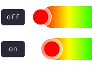
thumbShape
A global property for the thumb shape and appearance of all descendant slider components.
type: ThumbShapeType · default: "ring"
type ThumbShapeType = | "ring" | "solid" | "hollow" | "line" | "plus" | "pill" | "triangleUp" | "triangleDown" | "doubleTriangle" | "rect" | "circle";thumbStyle
A global property for the thumb’s View style across all descendant slider components.
type: ViewStyle1
thumbInnerStyle
A global property for the thumb’s inner View style across all descendant slider components.
type: ViewStyle1
thumbScaleAnimationValue
A global property for the scale value of the thumb animation when active.
type: number · default: 1.2
thumbScaleAnimationDuration
A global property for the duration of the thumb scale animation when active.
type: number · default: 100
renderThumb
Function that receives ThumbProps and returns a custom thumb component. Overrides thumbShape.
type: (props: ThumbProps) => ReactElement
ThumbProps
positionStyle StyleProp
Determines the position of the thumb — must be included in the component’s style.
width number
Extracted from thumbSize, used for thumb position calculation.
height number
Extracted from thumbSize, used for thumb position calculation.
adaptiveColor SharedValue<string>
White or black based on the contrast ratio of the current color.
currentColor SharedValue<string>
Updates whenever the color changes.
initialColor string
The initial color value.
Example
import Animated, { useAnimatedStyle } from "react-native-reanimated";
import type { RenderThumbProps } from "reanimated-color-picker";
function MyCustomThumb({ width, height, positionStyle, adaptiveColor, currentColor, initialColor }: RenderThumbProps) {  const animatedStyle = useAnimatedStyle(() => ({    borderColor: adaptiveColor.value,    backgroundColor: currentColor.value,  }));
  return (    <Animated.View      style={[{ width, height, borderWidth: 1, borderRadius: width / 2, overflow: "hidden" }, animatedStyle, positionStyle]}    >      <View style={{ backgroundColor: initialColor, width: "50%", height, alignSelf: "flex-end" }} />    </Animated.View>  );}
style
The container style of the ColorPicker.
type: ViewStyle1
enableColorAnnouncements
Enables accessibility announcements when the color changes.
When enabled, color updates are announced using the format defined by colorAnnouncementFormat.
type: boolean · default: true
colorAnnouncementFormat
Defines the format used when announcing color values for accessibility.
Accepts hex, rgb, rgba, hsl, hsla, hsv, hsva, hwb and hwba.
type: keyof ColorFormatsObject · default: "rgb"
Events
onChange
Fires every time the user modifies the color. Accepts worklet functions only — use onChangeJS for regular functions.
type: (color: ColorFormatsObject) => void · default: undefined
type ColorFormatsObject = { hex: string; rgb: string; rgba: string; hsl: string; hsla: string; hsv: string; hsva: string; hwb: string; hwba: string;};onChangeJS
Fires every time the user modifies the color. Accepts regular functions only — use onChange for worklet functions.
Avoid using setState inside onChange to prevent performance issues. Instead, use useSharedValue from react-native-reanimated.
type: (color: ColorFormatsObject) => void · default: undefined
type ColorFormatsObject = { hex: string; rgb: string; rgba: string; hsl: string; hsla: string; hsv: string; hsva: string; hwb: string; hwba: string;};onComplete
Fires when the user releases the slider handle or taps a swatch. Accepts worklet functions only — use onCompleteJS for regular functions.
type: (color: ColorFormatsObject) => void · default: undefined
type ColorFormatsObject = { hex: string; rgb: string; rgba: string; hsl: string; hsla: string; hsv: string; hsva: string; hwb: string; hwba: string;};onCompleteJS
Fires when the user releases the slider handle or taps a swatch. Accepts regular functions only — use onComplete for worklet functions.
type: (color: ColorFormatsObject) => void · default: undefined
type ColorFormatsObject = { hex: string; rgb: string; rgba: string; hsl: string; hsla: string; hsv: string; hsva: string; hwb: string; hwba: string;};Methods
setColor
Sets the displayed color without triggering onChange or onComplete. Useful for updating the picker color independently of the value prop.
type: (color: string, duration?: number) => void
import ColorPicker from "reanimated-color-picker";
import type { ColorPickerRef } from "reanimated-color-picker";
function MyComponent() {  const pickerRef = useRef<ColorPickerRef>(null);
  const setNewColorHandle = () => {    if (pickerRef.current) {      pickerRef.current.setColor("orange");    }  };
  return <ColorPicker ref={pickerRef}>{/* ... */}</ColorPicker>;}