<Panel3 />
A wheel-style circular panel for adjusting hue and either saturation or brightness. Move the thumb around the center to change hue, and toward or away from the center to adjust the channel set by centerChannel.
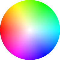
centerChannel: "saturation"
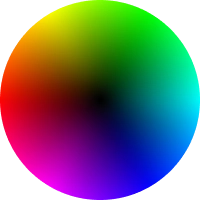
centerChannel: "brightness"
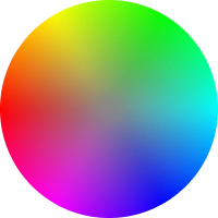
centerChannel: "hsl-saturation"
For more control, add a slider next to Panel3 that adjusts the opposite channel. For example, if centerChannel is "saturation", pair it with a <BrightnessSlider />, and vice versa.
Props
centerChannel
Determines which color channel is adjusted when moving the thumb toward or away from the center.
type: "saturation" | "brightness" | "hsl-saturation" · default: "saturation"
rotate
The degree of rotation applied to the hue circle.
type: number · default: 0
renderCenterLine
Controls whether a line is rendered from the center of the panel to the thumb.
type: boolean · default: false
boundedThumb
Determines whether the thumb is constrained within the boundaries of the panel. When false, part of the thumb may extend beyond the panel edges.
type: boolean · default: false
thumbSize
The thumb’s height and width.
type: number · default: 35
thumbColor
The thumb’s color. Defaults to an adaptive color based on contrast ratio.
type: string · default: interactive1
thumbShape
The thumb’s shape and appearance.
type: ThumbShapeType · default: "ring"
type ThumbShapeType = | "ring" | "solid" | "hollow" | "line" | "plus" | "pill" | "triangleUp" | "triangleDown" | "doubleTriangle" | "rect" | "circle";thumbStyle
The thumb’s containing View style.
type: ViewStyle2
thumbInnerStyle
The thumb’s inner View style.
type: ViewStyle2
thumbScaleAnimationValue
The scale value of the thumb animation when active.
type: number · default: 1.2
thumbScaleAnimationDuration
The duration of the thumb scale animation when active.
type: number · default: 100
renderThumb
Function that receives ThumbProps and returns a custom thumb component. Overrides thumbShape.
type: (props: ThumbProps) => ReactElement
ThumbProps
positionStyle StyleProp
Determines the position of the thumb — must be included in the component’s style.
width number
Extracted from thumbSize, used for thumb position calculation.
height number
Extracted from thumbSize, used for thumb position calculation.
adaptiveColor SharedValue<string>
White or black based on the contrast ratio of the current color.
currentColor SharedValue<string>
Updates whenever the color changes.
initialColor string
The initial color value.
Example
import Animated, { useAnimatedStyle } from "react-native-reanimated";
import type { RenderThumbProps } from "reanimated-color-picker";
function MyCustomThumb({ width, height, positionStyle, adaptiveColor, currentColor, initialColor }: RenderThumbProps) {  const animatedStyle = useAnimatedStyle(() => ({    borderColor: adaptiveColor.value,    backgroundColor: currentColor.value,  }));
  return (    <Animated.View      style={[{ width, height, borderWidth: 1, borderRadius: width / 2, overflow: "hidden" }, animatedStyle, positionStyle]}    >      <View style={{ backgroundColor: initialColor, width: "50%", height, alignSelf: "flex-end" }} />    </Animated.View>  );}
gestures
An array of gestures or composed gestures from react-native-gesture-handler that run simultaneously with the color picker’s gestures.
type: Gesture[] · default: []
adaptSpectrum
The slider background color spectrum adapts to changes in saturation and brightness.
type: boolean · default: false
style
The panel’s container style.
type: ViewStyle2
accessibilityLabel
Panel’s label for accessibility.
type: string
accessibilityHint
Panel’s hint for accessibility.
type: string