<ExtraThumb />
Adds an extra thumb to the Panel3 component. Used exclusively as a color indicator — it does not respond to gestures.
This component only works inside Panel3.
Usage
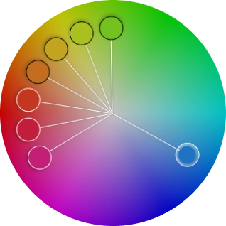
<Panel3 style={styles.panelStyle} renderCenterLine adaptSpectrum> <ExtraThumb thumbShape="circle" hueTransform={120} /> <ExtraThumb thumbShape="circle" hueTransform={140} /> <ExtraThumb thumbShape="circle" hueTransform={160} /> {/* using colorTransform to transform the hue channel */} <ExtraThumb thumbShape="circle" colorTransform={color => { "worklet"; return colorKit.runOnUI().spin(color, 180).hsv().object(); }} /> <ExtraThumb thumbShape="circle" hueTransform={200} /> <ExtraThumb thumbShape="circle" hueTransform={220} /> <ExtraThumb thumbShape="circle" hueTransform={240} /></Panel3>Props
colorTransform
A worklet function that transforms the color in HSV space. Receives an HSVA object and returns a new HSVA object that determines the thumb’s position inside the panel.
type: (color: HSVObject) => HSVObject
hueTransform
An alternative to colorTransform for transforming the hue channel. Accepts negative values and percentage strings (e.g. '50%' or 50).
type: string | number
saturationTransform
An alternative to colorTransform for transforming the saturation channel. Accepts negative values and percentage strings (e.g. '50%' or 50).
type: string | number
brightnessTransform
An alternative to colorTransform for transforming the brightness channel. Accepts negative values and percentage strings (e.g. '50%' or 50).
type: string | number
onChange
Fires every time the user modifies the color, providing the transformed color via a worklet callback. Accepts worklet functions only — use onChangeJS for regular functions. The color object exposes: hex, rgb, rgba, hsv, hsva, hwb, hwba, hsl, and hsla.
type: (color: object) => void · default: undefined
onChangeJS
Fires every time the user modifies the color, providing the transformed color via a regular callback. Accepts regular functions only — use onChange for worklet functions. The color object exposes: hex, rgb, rgba, hsv, hsva, hwb, hwba, hsl, and hsla.
type: (color: object) => void · default: undefined
Avoid using setState inside onChange to prevent performance issues. Instead, use useSharedValue from react-native-reanimated.
thumbSize
The thumb’s height and width.
type: number · default: inherit from Panel3
thumbColor
The thumb’s color.
type: string · default: inherit from Panel3
thumbShape
The thumb’s shape and appearance.
type: ThumbShapeType · default: inherit from Panel3
type ThumbShapeType = | "ring" | "solid" | "hollow" | "line" | "plus" | "pill" | "triangleUp" | "triangleDown" | "doubleTriangle" | "rect" | "circle";thumbStyle
The thumb’s containing View style.
type: ViewStyle1 · default: inherit from Panel3
thumbInnerStyle
The thumb’s inner View style.
type: ViewStyle1 · default: inherit from Panel3
renderCenterLine
Controls whether a line is rendered from the center of the panel to the thumb.
type: boolean · default: inherit from Panel3
renderThumb
Function that receives ThumbProps and returns a custom thumb component. Overrides thumbShape.
type: (props: ThumbProps) => ReactElement
ThumbProps
positionStyle StyleProp
Determines the position of the thumb — must be included in the component’s style.
width number
Extracted from thumbSize, used for thumb position calculation.
height number
Extracted from thumbSize, used for thumb position calculation.
adaptiveColor SharedValue<string>
White or black based on the contrast ratio of the current color.
currentColor SharedValue<string>
Updates whenever the color changes.
initialColor string
The initial color value.
Example
import Animated, { useAnimatedStyle } from "react-native-reanimated";
import type { RenderThumbProps } from "reanimated-color-picker";
function MyCustomThumb({ width, height, positionStyle, adaptiveColor, currentColor, initialColor }: RenderThumbProps) {  const animatedStyle = useAnimatedStyle(() => ({    borderColor: adaptiveColor.value,    backgroundColor: currentColor.value,  }));
  return (    <Animated.View      style={[{ width, height, borderWidth: 1, borderRadius: width / 2, overflow: "hidden" }, animatedStyle, positionStyle]}    >      <View style={{ backgroundColor: initialColor, width: "50%", height, alignSelf: "flex-end" }} />    </Animated.View>  );}