<InputWidget />
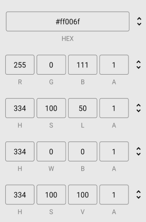
An input component for entering color values in RGB, HEX, HSL, HWB, and HSV formats. Includes a cycle button to switch between formats.
Props
defaultFormat
The initial color format shown when the component loads.
type: 'HEX' | 'RGB' | 'HSL' | 'HWB' | 'HSV'
formats
The color formats included in the cycle and the order they appear.
type: Array<'HEX' | 'RGB' | 'HSL' | 'HWB' | 'HSV'>
disableAlphaChannel
Disables the alpha channel input, preventing users from setting the color’s opacity.
type: boolean · default: false
inputStyle
The style of the text input fields.
type: TextStyle1
inputProps
Additional props passed to the TextInput components.
type: InputProps
inputTitleStyle
The style of the title displayed below the input fields indicating the current color format.
type: TextStyle1
containerStyle
The style of the container wrapping the input fields and cycle button.
type: ViewStyle1
iconColor
The color of the cycle button icon.
type: string
iconStyle
The style of the cycle button icon.
type: ImageStyle1
cycleButtonAccessibilityLabel
Accessibility label for the cycle button. Used by screen readers to identify the button.
type: string
cycleButtonAccessibilityHint
Accessibility hint for the cycle button. Describes what happens when the user activates it.
type: string