<GreenSlider />

A slider for adjusting the color’s green channel.
Props
sliderThickness
The slider’s thickness — width in vertical mode, height in horizontal mode.
type: number · default: 25
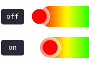
adaptSpectrum
The slider background color spectrum adapts to changes.
type: boolean · default: false
boundedThumb
Determines whether the thumb is constrained within the boundaries of the slider. When false, part of the thumb may extend beyond the slider edges.
type: boolean · default: false
thumbSize
The size of the slider’s thumb.
type: number · default: 35
thumbColor
The thumb’s color. Defaults to an adaptive color based on contrast ratio.
type: string · default: interactive1
thumbShape
The thumb’s shape and appearance.
type: ThumbShapeType · default: "ring"
type ThumbShapeType = | "ring" | "solid" | "hollow" | "line" | "plus" | "pill" | "triangleUp" | "triangleDown" | "doubleTriangle" | "rect" | "circle";thumbStyle
The thumb’s containing View style.
type: ViewStyle2
thumbInnerStyle
The thumb’s inner View style.
type: ViewStyle2
thumbScaleAnimationValue
The scale value of the thumb animation when active.
type: number · default: 1.2
thumbScaleAnimationDuration
The duration of the thumb scale animation when active.
type: number · default: 100
renderThumb
Function that receives ThumbProps and returns a custom thumb component. Overrides thumbShape.
type: (props: ThumbProps) => ReactElement
ThumbProps
positionStyle StyleProp
Determines the position of the thumb — must be included in the component’s style.
width number
Extracted from thumbSize, used for thumb position calculation.
height number
Extracted from thumbSize, used for thumb position calculation.
adaptiveColor SharedValue<string>
White or black based on the contrast ratio of the current color.
currentColor SharedValue<string>
Updates whenever the color changes.
initialColor string
The initial color value.
Example
import Animated, { useAnimatedStyle } from "react-native-reanimated";
import type { RenderThumbProps } from "reanimated-color-picker";
function MyCustomThumb({ width, height, positionStyle, adaptiveColor, currentColor, initialColor }: RenderThumbProps) {  const animatedStyle = useAnimatedStyle(() => ({    borderColor: adaptiveColor.value,    backgroundColor: currentColor.value,  }));
  return (    <Animated.View      style={[{ width, height, borderWidth: 1, borderRadius: width / 2, overflow: "hidden" }, animatedStyle, positionStyle]}    >      <View style={{ backgroundColor: initialColor, width: "50%", height, alignSelf: "flex-end" }} />    </Animated.View>  );}
reverse
Reverses the slider direction.
type: boolean · default: false
vertical
Changes the slider orientation to vertical.
type: boolean · default: false
gestures
An array of gestures or composed gestures from react-native-gesture-handler that run simultaneously with the color picker’s gestures.
type: Gesture[] · default: []
style
The slider’s container style.
type: ViewStyle2
accessibilityLabel
Slider’s label for accessibility.
type: string
accessibilityHint
Slider’s hint for accessibility.
type: string