<ExtraThumb />
Adds an extra thumb to the Panel3 component.
Note
- This component is used exclusively in the
Panel3component. - It serves as an indicator for the desired color and does not respond to any gestures.
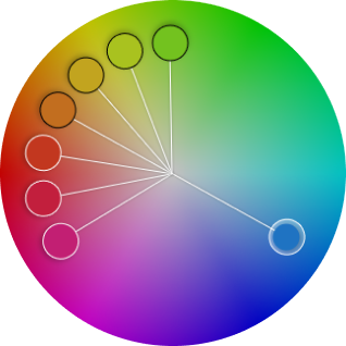
Usage
<Panel3 style={styles.panelStyle} renderCenterLine adaptSpectrum>
  <ExtraThumb thumbShape='circle' hueTransform={120} />
  <ExtraThumb thumbShape='circle' hueTransform={140} />
  <ExtraThumb thumbShape='circle' hueTransform={160} />
  {/* using colorTransform to transform the hue channel */}
  <ExtraThumb
    thumbShape='circle'
    colorTransform={color => {
      'worklet';
      return colorKit.runOnUI().spin(color, 180).hsv().object();
    }}
  />
  <ExtraThumb thumbShape='circle' hueTransform={200} />
  <ExtraThumb thumbShape='circle' hueTransform={220} />
  <ExtraThumb thumbShape='circle' hueTransform={240} />
</Panel3>
Props
colorTransform
- A Worklet function to transform or modify the color in the HSV (Hue, Saturation, Value) color space, taking an HSVA color object as input and returning a new HSVA color object. The returned object determines the thumb's position inside the panel.
- Type:
(color: HSVObject) => HSVObject
hueTransform
-
An alternative to
colorTransformfor transforming the hue channel, where the transform amount can be anumberor astring, allowing negative values. For example, it can be expressed as'50%'or50. - Type:
string | number
saturationTransform
-
An alternative to
colorTransformfor transforming the saturation channel, where the transform amount can be anumberor astring, allowing negative values. For example, it can be expressed as'50%'or50. - Type:
string | number
brightnessTransform
-
An alternative to
colorTransformfor transforming the brightness channel, where the transform amount can be anumberor astring, allowing negative values. For example, it can be expressed as'50%'or50. - Type:
string | number
onChange
- Triggers every time the user modifies the color, allowing you to get the transformed color through a worklet function passed as a callback.
-
Accepts
workletfunction only. For non-workletfunctions, useonChangeJS. -
The passed color object has the following properties:
hex,rgb,rgba,hsv,hsva,hwb,hwba,hsl, andhsla - Type:
(color: object) => void - Default:
undefined
onChangeJS
- Triggers every time the user modifies the color, allowing you to get the transformed color through a worklet function passed as a callback.
-
Accepts none-
workletfunction. Forworkletfunctions, useonChange. -
The passed color object has the following properties:
hex,rgb,rgba,hsv,hsva,hwb,hwba,hsl, andhsla - Type:
(color: object) => void - Default:
undefined
tip
-
To prevent performance issues, it is best to avoid using
setStatein theonChangecallback. -
It is highly recommended to utilize the
useSharedValuefunction from thereact-native-reanimatedlibrary.
thumbSize
- Thumb size (height*width).
- Type:
number - Default: inherit from
Panel3
thumbColor
- Change thumb's color.
- Type:
string - Default: inherit from
Panel3
thumbShape
- Change thumb's shape and appearance.
- Type:
string -
Values:
'ring' | 'solid' | 'hollow' | 'line' | 'plus' | 'pill' | 'triangleUp' | 'triangleDown' | 'doubleTriangle' | 'rect' | 'circle' - Default: inherit from
Panel3
thumbStyle
- Thumb's containing View's style.
- Type:
ViewStyle - Default: inherit from
Panel3
thumbInnerStyle
- Thumb's inner View(s) style.
- Type:
ViewStyle - Default: inherit from
Panel3
renderCenterLine
- Controls whether to render a line from the center of the panel to the thumb (handle).
- Type:
boolean - Default: inherit from
Panel3
renderThumb
- Function which receives
ThumbPropsand returns a custom thumb component. - Overrides
thumbShape
ThumbProps
| Prop | Type | Description |
|---|---|---|
positionStyle |
StyleProp |
This style determines the position of the thumb and is a crucial element that should be included. |
width |
number |
Extracted from the thumbSize prop and it's important for thumb position
calculation.
|
height |
number |
Extracted from the thumbSize prop and it's important for thumb position
calculation.
|
adaptiveColor |
SharedValue<string> |
White or black based on the contrast ratio. |
currentColor |
SharedValue<string> |
This shared value will update whenever the color changes. |
initialColor |
string |
The initial color value as a string. |
- Example Usage:
import Animated, { useAnimatedStyle } from 'react-native-reanimated';
import type { RenderThumbProps } from 'reanimated-color-picker';

function MyCustomThumb({ width, height, positionStyle, adaptiveColor, currentColor, initialColor }: RenderThumbProps) {
  const animatedStyle = useAnimatedStyle(() => ({
    borderColor: adaptiveColor.value,
    backgroundColor: currentColor.value,
  }));

  return (
    <Animated.View
      style={[{ width, height, borderWidth: 1, borderRadius: width / 2, overflow: 'hidden' }, animatedStyle, positionStyle]}
    >
      <View style={{ backgroundColor: initialColor, width: '50%', height, alignSelf: 'flex-end' }} />
    </Animated.View>
  );
}