<InputWidget />
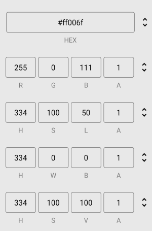
- The input widget component allows you to input color values in various formats, including RGB, HEX, HSL, HWB, and HSV. The component features a button that lets you cycle through these formats, making it easy to switch between them and find the one that suits your needs.
Props
defaultFormat
-
The
defaultFormatprop determines the initial color format for the input widget component. -
It accepts one of the following values:
'HEX' | 'RGB' | 'HSL' | 'HWB' | 'HSV'
disableAlphaChannel
- This prop allows you to disable the alpha channel input. If set to true, the input widget will ignore the alpha channel and prevent users from setting the opacity of the selected color.
type: booleandefault: false
formats
-
The
formatsprop determines which color formats are included in the input widget component and the order they appear when cycling through them. -
It accepts an array of the following values:
'HEX' | 'RGB' | 'HSL' | 'HWB' | 'HSV'
inputStyle
-
The
inputStyleprop sets the style for theInputTextcomponents that make up the input fields for each color format. - It accepts a
StyleProp<TextStyle>object.
inputProps
-
The
inputPropsprop sets the props for theTextInputcomponents that make up the input fields for each color format. - It accepts an
InputPropsobject.
inputTitleStyle
-
The
inputTitleStyleprop sets the style for theTextcomponent that displays the title for the input fields. - This title is located below the input fields and indicates which color format is currently displayed.
- It accepts a
StyleProp<TextStyle>object.
containerStyle
-
The
containerStyleprop sets the style for theViewcomponent that wraps around all the input fields and the cycle button. - It accepts a
StyleProp<ViewStyle>object.
iconColor
-
The
iconColorprop sets the color for the cycle button icon, which is an Image component that cycles through the available color formats when clicked. - It accepts a
stringrepresenting a color value.
iconStyle
- The
iconStyleprop sets the style for the cycle button icon. - It accepts a
StyleProp<ImageStyle>object.