<Panel1 />
-
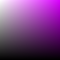
A square-shaped slider, reminiscent of Adobe style, is utilized to adjust the brightness and saturation of colors..
-
Move the handle horizontally to change the color's saturation.
-
Move the handle vertically to change the color's brightness.
tip
-
Add
<HueSlider />component also to gain control over the three color channels.
Props
boundedThumb
- Determines whether the panel slider thumb (or handle) should be constrained to stay within the boundaries of the panel.
-
When set to
true, the thumb will not be allowed to move beyond the edges of the panel. - When set to
false, part of it will be outside of the panel bounds. type: booleandefault: false
thumbSize
- Panel's handle (thumb) size (height*width).
type: numberdefault: 35
thumbColor
- Change thumb's color.
type: stringdefault: interactive*
*interactive
- The color of the thumb will be adjusted according to the contrast ratio, in the absence of a specific color value.
thumbShape
- Change thumb's shape and appearance.
type: string-
values:'ring' | 'solid' | 'hollow' | 'line' | 'plus' | 'pill' | 'triangleUp' | 'triangleDown' | 'doubleTriangle' | 'rect' | 'circle' default: 'ring'
thumbStyle
- Thumb's containing View's style.
type: ViewStyle
thumbInnerStyle
- Thumb's inner View(s) style.
type: ViewStyle
thumbScaleAnimationValue
- Controls the scale value animation of the thumb when active.
type: numberdefault: 1.2
thumbScaleAnimationDuration
- Sets the duration of the scale animation of the thumb when active.
type: numberdefault: 100
renderThumb
- Function which receives
ThumbPropsand returns a custom thumb component. - Overrides
thumbShape
ThumbProps
| Prop | Type | Description |
|---|---|---|
positionStyle |
StyleProp |
This style determines the position of the thumb and is a crucial element that should be included. |
width |
number |
Extracted from the thumbSize prop and it's important for thumb position
calculation.
|
height |
number |
Extracted from the thumbSize prop and it's important for thumb position
calculation.
|
adaptiveColor |
SharedValue<string> |
White or black based on the contrast ratio. |
currentColor |
SharedValue<string> |
This shared value will update whenever the color changes. |
initialColor |
string |
The initial color value as a string. |
- Example Usage:
import Animated, { useAnimatedStyle } from 'react-native-reanimated';
import type { RenderThumbProps } from 'reanimated-color-picker';

function MyCustomThumb({ width, height, positionStyle, adaptiveColor, currentColor, initialColor }: RenderThumbProps) {
  const animatedStyle = useAnimatedStyle(() => ({
    borderColor: adaptiveColor.value,
    backgroundColor: currentColor.value,
  }));

  return (
    <Animated.View
      style={[{ width, height, borderWidth: 1, borderRadius: width / 2, overflow: 'hidden' }, animatedStyle, positionStyle]}
    >
      <View style={{ backgroundColor: initialColor, width: '50%', height, alignSelf: 'flex-end' }} />
    </Animated.View>
  );
}
gestures
- An array of gestures or composed gestures from
react-native-gesture-handler. - These gestures will run simultaneously with the color picker gestures.
type: Gesture[]default: []
style
- Panel's container style.
type: ViewStyle
note
- Certain style properties will be overridden.