<Panel2 />
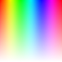
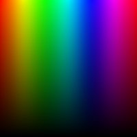
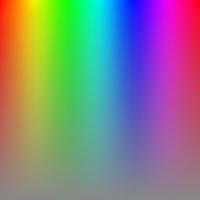
| vertical channel: "saturation" | vertical channel: "brightness" | vertical channel: "hsl-saturation" |
|---|---|---|
|
|
|
-
A square-shaped slider (windows style) is utilized to adjust the hue and (saturation or brightness) channels.
-
Move the thumb (handle) horizontally to change the color's hue.
-
Drag the thumb (handle) up or down to adjust either the saturation or the brightness of the color, depending on the
verticalChannelprop.
If you want to give your users more control over the color selection, you can add another slider
next to Panel2 that adjusts the opposite channel. For example, if
verticalChannel is "saturation", you can add a
<BrightnessSlider />, and vice versa.
Props
verticalChannel
- Determines which color channel to adjust when moving the thumb vertically on the slider.
-
type: "saturation" | "brightness" | "hsl-saturation" default: "saturation"
boundedThumb
- Determines whether the panel slider thumb (or handle) should be constrained to stay within the boundaries of the panel.
-
When set to
true, the thumb will not be allowed to move beyond the edges of the panel. - When set to
false, part of it will be outside of the panel bounds. type: booleandefault: false
thumbSize
- Panel's handle (thumb) size (height*width).
type: numberdefault: 35
thumbColor
- Change thumb's color.
type: stringdefault: interactive*
- The thumb color will be changed depending on the contrast ratio if no color value is passed.
thumbShape
- Change thumb's shape and appearance.
type: string-
values:'ring' | 'solid' | 'hollow' | 'line' | 'plus' | 'pill' | 'triangleUp' | 'triangleDown' | 'doubleTriangle' | 'rect' | 'circle' default: 'ring'
thumbStyle
- Thumb's containing View's style.
type: ViewStyle
thumbInnerStyle
- Thumb's inner View(s) style.
type: ViewStyle
thumbScaleAnimationValue
- Controls the scale value animation of the thumb when active.
type: numberdefault: 1.2
thumbScaleAnimationDuration
- Sets the duration of the scale animation of the thumb when active.
type: numberdefault: 100
renderThumb
- Function which receives
ThumbPropsand returns a custom thumb component. - Overrides
thumbShape
ThumbProps
| Prop | Type | Description |
|---|---|---|
positionStyle |
StyleProp |
This style determines the position of the thumb and is a crucial element that should be included. |
width |
number |
Extracted from the thumbSize prop and it's important for thumb position
calculation.
|
height |
number |
Extracted from the thumbSize prop and it's important for thumb position
calculation.
|
adaptiveColor |
SharedValue<string> |
White or black based on the contrast ratio. |
currentColor |
SharedValue<string> |
This shared value will update whenever the color changes. |
initialColor |
string |
The initial color value as a string. |
- Example Usage:
import Animated, { useAnimatedStyle } from 'react-native-reanimated';
import type { RenderThumbProps } from 'reanimated-color-picker';

function MyCustomThumb({ width, height, positionStyle, adaptiveColor, currentColor, initialColor }: RenderThumbProps) {
  const animatedStyle = useAnimatedStyle(() => ({
    borderColor: adaptiveColor.value,
    backgroundColor: currentColor.value,
  }));

  return (
    <Animated.View
      style={[{ width, height, borderWidth: 1, borderRadius: width / 2, overflow: 'hidden' }, animatedStyle, positionStyle]}
    >
      <View style={{ backgroundColor: initialColor, width: '50%', height, alignSelf: 'flex-end' }} />
    </Animated.View>
  );
}
gestures
- An array of gestures or composed gestures from
react-native-gesture-handler. - These gestures will run simultaneously with the color picker gestures.
type: Gesture[]default: []
adaptSpectrum
- Slider background color spectrum adapts to changes in saturation and brightness.
type: booleandefault: false
reverseHue
- Reverse (flip) hue direction.
type: booleandefault: false
reverseVerticalChannel
- Reverse (flip) the direction of the vertical channel's saturation or brightness.
type: booleandefault: false
style
- Panel's container style.
type: ViewStyle
- Certain style properties will be overridden.