<Panel4 />
-
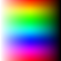
A slider with a square shape is used to adjust the channels of hue, saturation, and brightness.
-
To adjust the color's saturation and brightness, move the handle horizontally..
-
Move the handle vertically to change the color's hue.
This panel cannot show all colors because it has a limited range of colors it can display. For example, if the input color has 50% saturation and 50% brightness, the panel thumb (handle) location won’t be accurate because it cannot show that color. This means that the color you select may not be exactly what you see in the panel.
Props
boundedThumb
- Determines whether the panel slider thumb (or handle) should be constrained to stay within the boundaries of the panel.
-
When set to
true, the thumb will not be allowed to move beyond the edges of the panel. - When set to
false, part of it will be outside of the panel bounds. type: booleandefault: false
thumbSize
- Panel's handle (thumb) size (height*width).
type: numberdefault: 35
thumbColor
- Change thumb's color.
type: stringdefault: interactive*
- The thumb color will be changed depending on the contrast ratio if no color value is passed.
thumbShape
- Change thumb's shape and appearance.
type: stringvalues:default: 'ring'
thumbStyle
- Thumb's containing View's style.
type: ViewStyle
thumbInnerStyle
- Thumb's inner View(s) style.
type: ViewStyle
thumbScaleAnimationValue
- Controls the scale value animation of the thumb when active.
type: numberdefault: 1.2
thumbScaleAnimationDuration
- Sets the duration of the scale animation of the thumb when active.
type: numberdefault: 100
renderThumb
- Function which receives
ThumbPropsand returns a custom thumb component. - Overrides
thumbShape
ThumbProps
| Prop | Type | Description |
|---|---|---|
positionStyle |
StyleProp |
This style determines the position of the thumb and is a crucial element that should be included. |
width |
number |
Extracted from the thumbSize prop and it's important for thumb position
calculation.
|
height |
number |
Extracted from the thumbSize prop and it's important for thumb position
calculation.
|
adaptiveColor |
SharedValue<string> |
White or black based on the contrast ratio. |
currentColor |
SharedValue<string> |
This shared value will update whenever the color changes. |
initialColor |
string |
The initial color value as a string. |
- Example Usage:
import Animated, { useAnimatedStyle } from 'react-native-reanimated';
import type { RenderThumbProps } from 'reanimated-color-picker';

function MyCustomThumb({ width, height, positionStyle, adaptiveColor, currentColor, initialColor }: RenderThumbProps) {
  const animatedStyle = useAnimatedStyle(() => ({
    borderColor: adaptiveColor.value,
    backgroundColor: currentColor.value,
  }));

  return (
    <Animated.View
      style={[{ width, height, borderWidth: 1, borderRadius: width / 2, overflow: 'hidden' }, animatedStyle, positionStyle]}
    >
      <View style={{ backgroundColor: initialColor, width: '50%', height, alignSelf: 'flex-end' }} />
    </Animated.View>
  );
}
gestures
- An array of gestures or composed gestures from
react-native-gesture-handler. - These gestures will run simultaneously with the color picker gestures.
type: Gesture[]default: []
reverseHue
- Reverse (flip) hue direction.
type: booleandefault: false
reverseHorizontalChannels
- Reverse (flip) the direction of the horizontal channel's brightness and saturation..
type: booleandefault: false
style
- Panel's container style.
type: ViewStyle
- Certain style properties will be overridden.